Dovercourt, Harwich
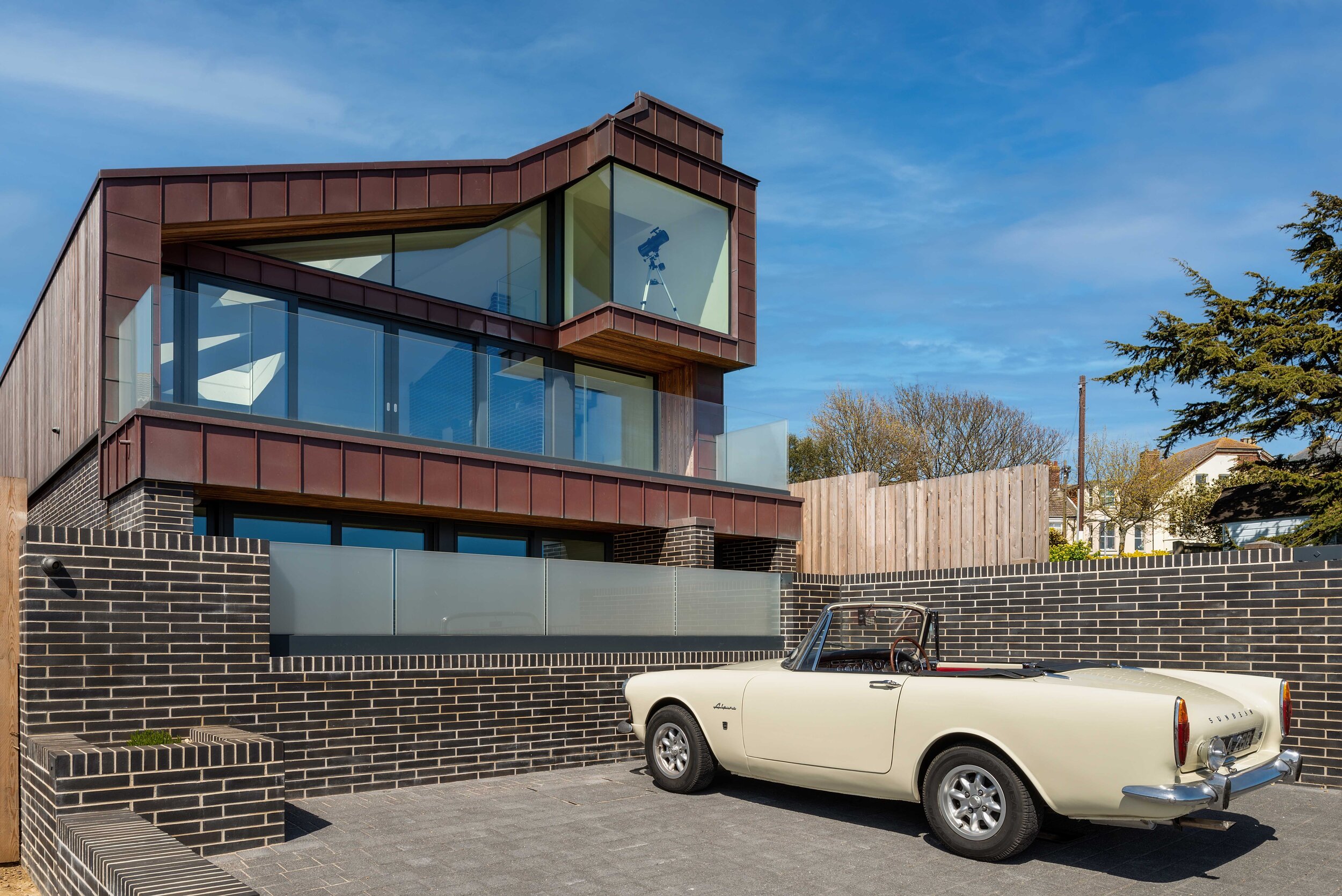
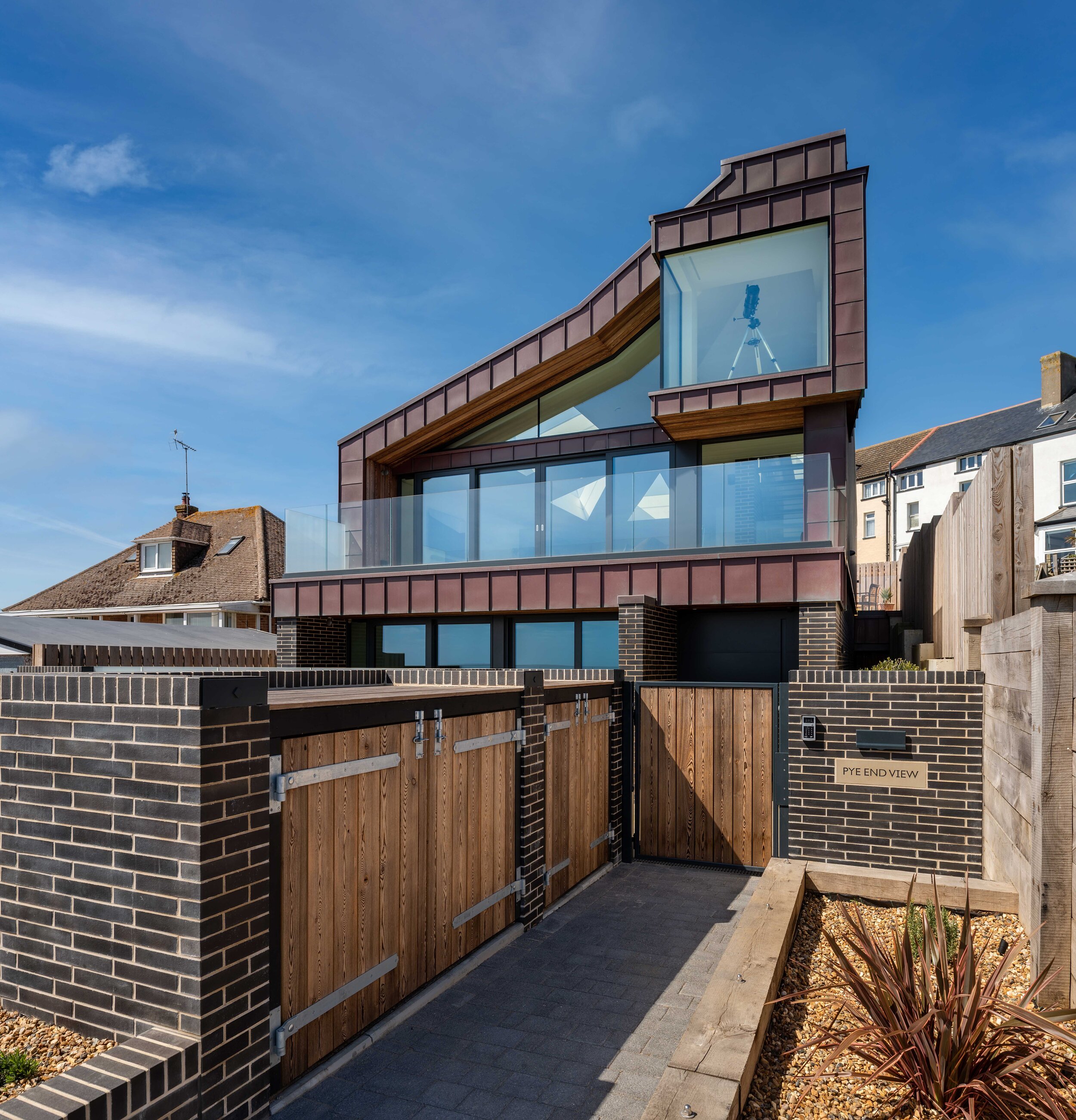


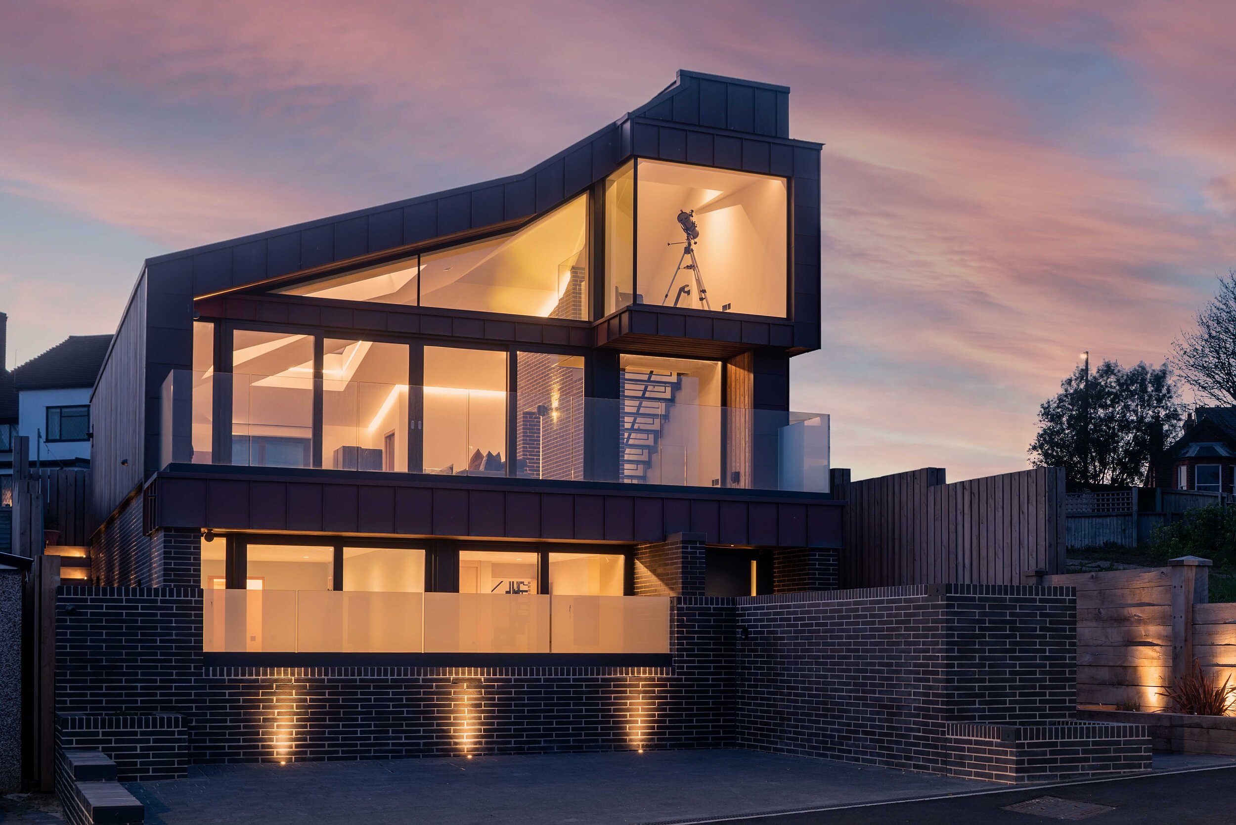
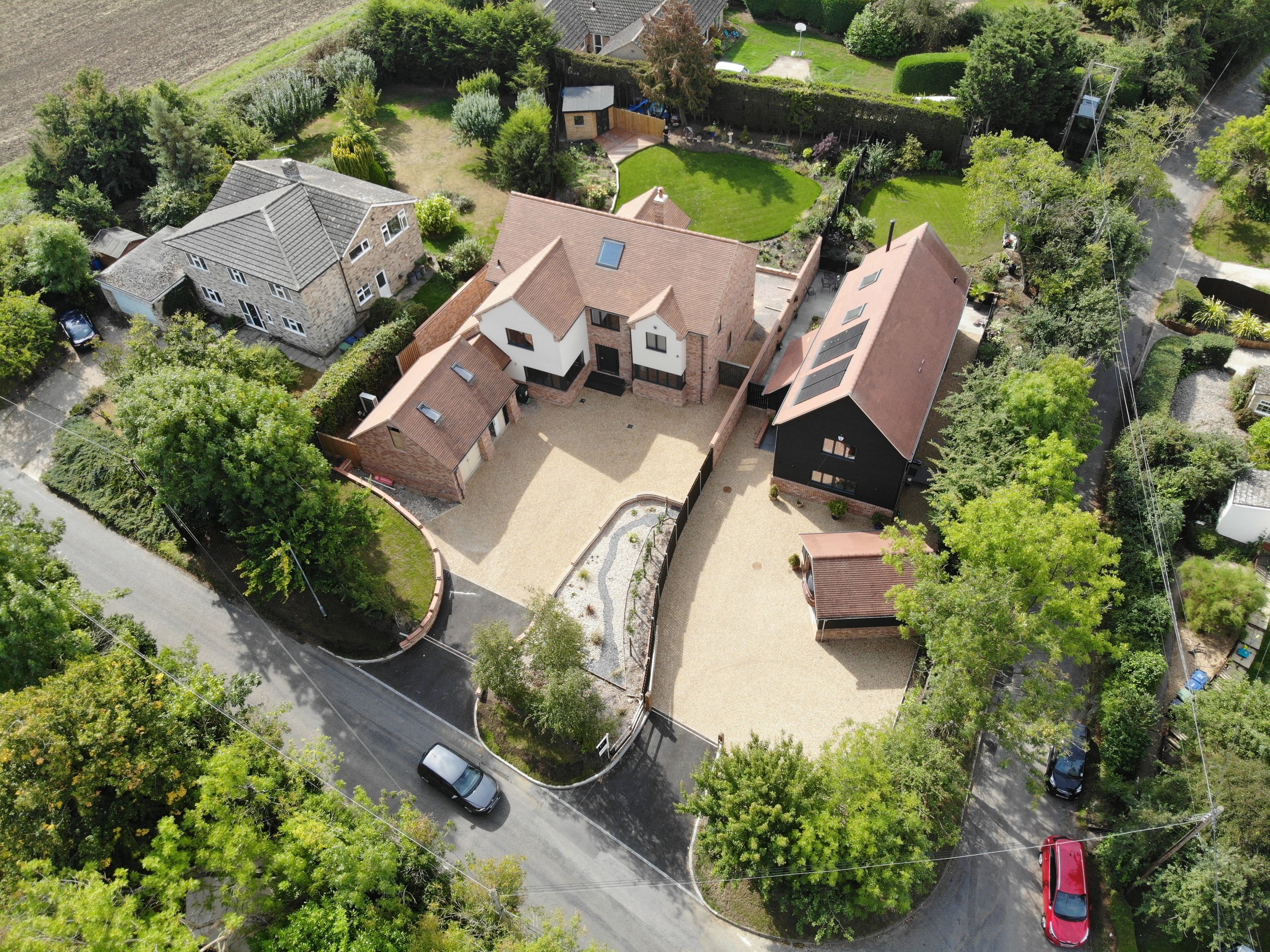
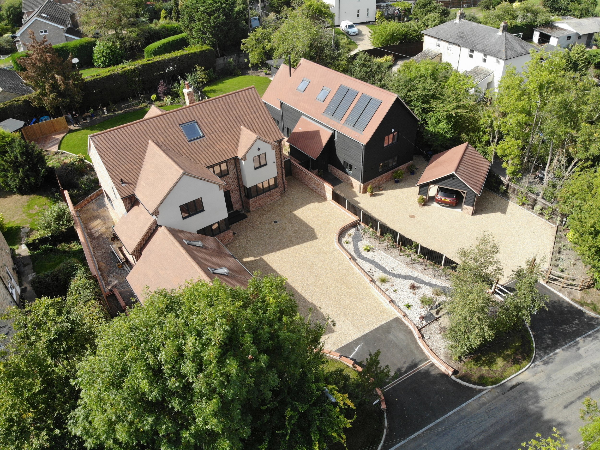
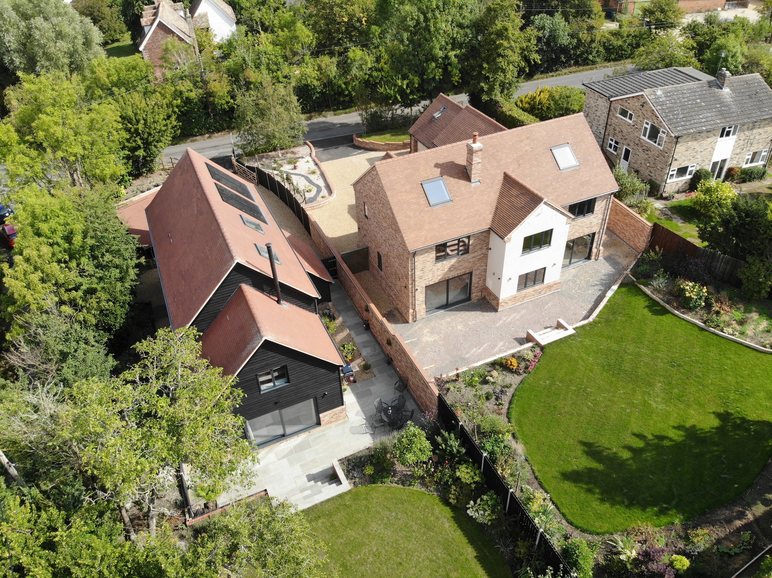
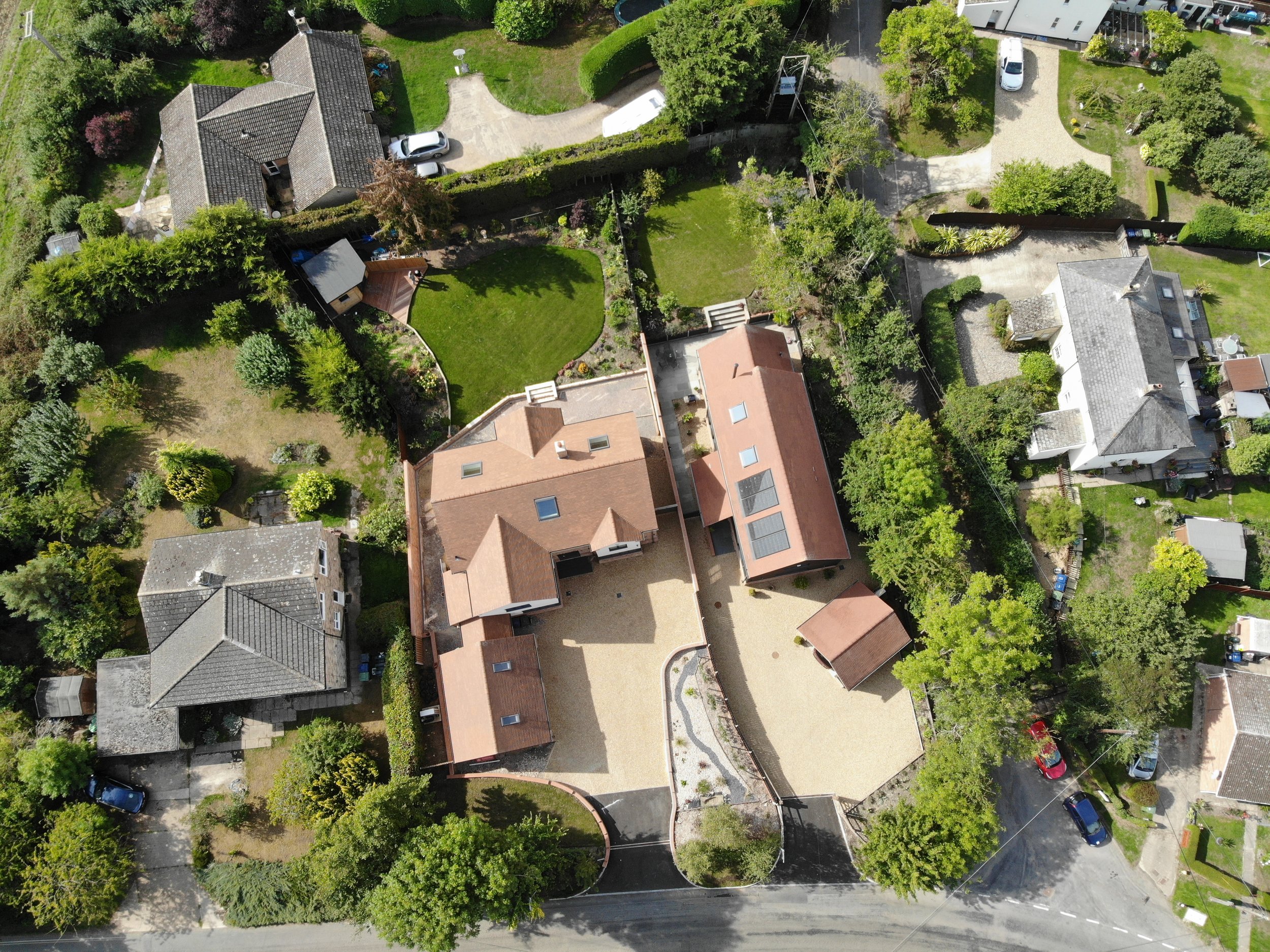
Harvey Norman Architects have designed a striking, contemporary second home with WOW factor for their client who has spent his career restoring historic buildings!
Building Excellence and Considerate Contractor Scheme Awards 2021
THE ARCHITECT’S BRIEF
Essex riviera house “Pye End View” has been shortlisted for the Daily Telegraph and Homebuilding & Renovating Awards 2021
Having spent his career creating a highly successful Cambridge based building restoration, carpentry and stonemasonry contractor specialising in historic and listed building structures across the country, Stephen wanted a swansong to take him into retirement.
Opting for a completely different architectural direction, his idea was to build a contemporary coastal retreat, close to his other passion sailing his boat off the Essex coast.
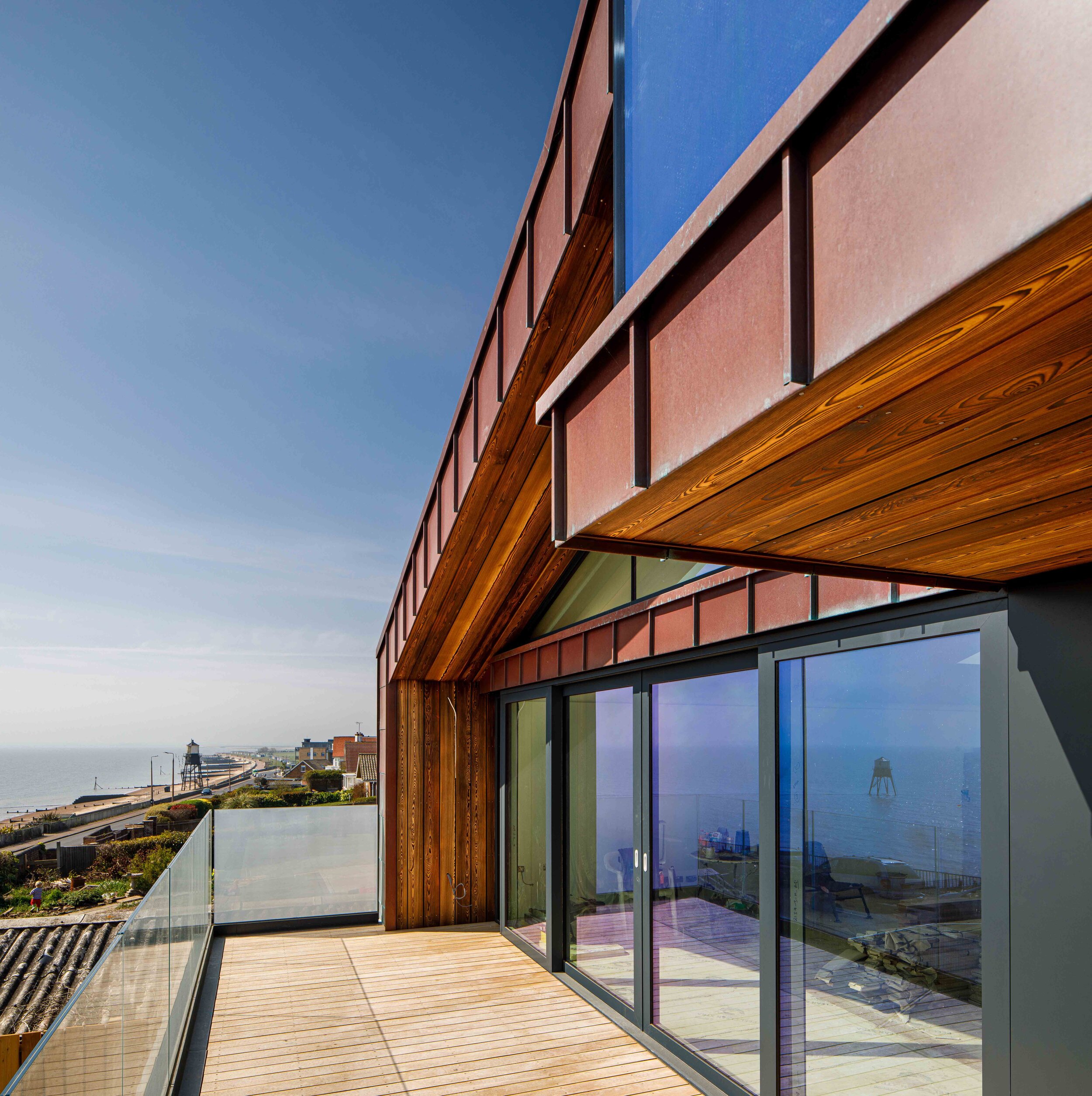
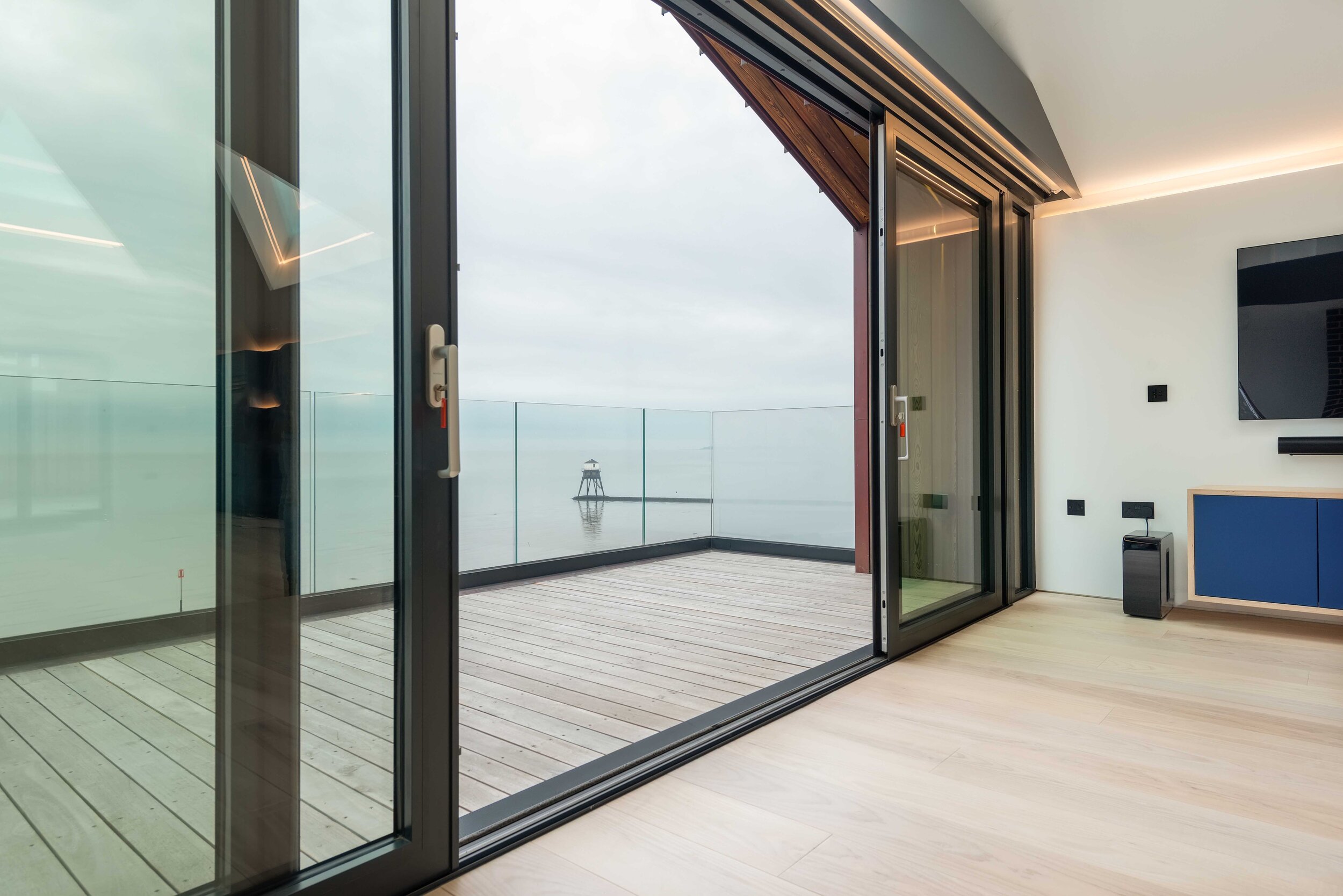
Stephen was aware of an empty infill plot on the Dovercourt seafront, on one side adjacent to a war memorial and on the other the mid-19th century High and Low screw-pile Dovercourt lighthouse structures. Raised on the hillside some 15 meters above the beach, the site has fantastic sea views overlooking the shipping channel to the historic Harwich international harbour serving container ships and the Hook of Holland ferry. Also visible on the far horizon, three wind farms and a World War II Maunsell Sea Fort put there originally to defend entry to the Thames estuary approaches.
Like many British seaside towns Dovercourt’s fortunes have varied over the years and as time has passed it has developed a varied building stock and character. The area is currently on the way up being popular with empty nesters moving to the coast and their visiting families.
The brief given to Harvey Norman Architects was as follows:
To create a contemporary two bed second home maximising on views that Stephen could enjoy together with family and friends.
Although not to be certified Passivehaus, the proposal should strive to do much better than building regulation sustainability standards adopting a fabric-first approach with an emphasis on insulation, airtightness and ventilation.
With Stephen’s experience as both a builder, sailor and boat owner where possible detailing and choice of materials should be informed where possible by maritime design.
It should also be a clear statement of its time, signalling the rise and popularity of the area and possibly be an inspiration for others to do similar and regenerate the Marine Parade.
THE CHALLENGES
The site had remained undeveloped primarily due to a lack of a foul drainage connection. With his construction experience, Stephen had realised how to unlock this via a pumped solution and negotiated access across neighbouring land and as a result bought the land at risk.
As well as a lack of foul drainage, the site came with other challenges.
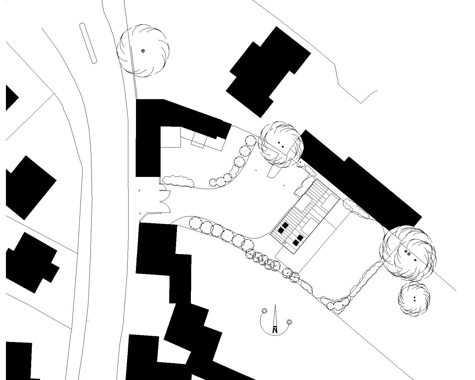
The rectangular 270m2 site had falls across it in two directions, north-west to south-east some 2.8-meter over a run of 26 meters. Then north-east to south-west, at the centre of the site, 1.7 meters. This resulted in the potential of surface water runoff from the higher north.
Located on the marine parade to the south-east there is a lot of pedestrian traffic on the road in front of the site, which meant that privacy and security while maximising views out towards the sea needed to be addressed.
To the rear, higher up the hill, on the other side of a small access track along the rear boundary, are located three-storey Victorian terraced houses. Again, these created issues of privacy and neighbour consideration.
·The site also had a relatively narrow frontage of 10.5 meters.+
Another major issue was the coastal location and exposure to the elements and sea salt with the corrosive effect that could have on materials.
THE SOLUTION
THE DESIGN CONCEPT
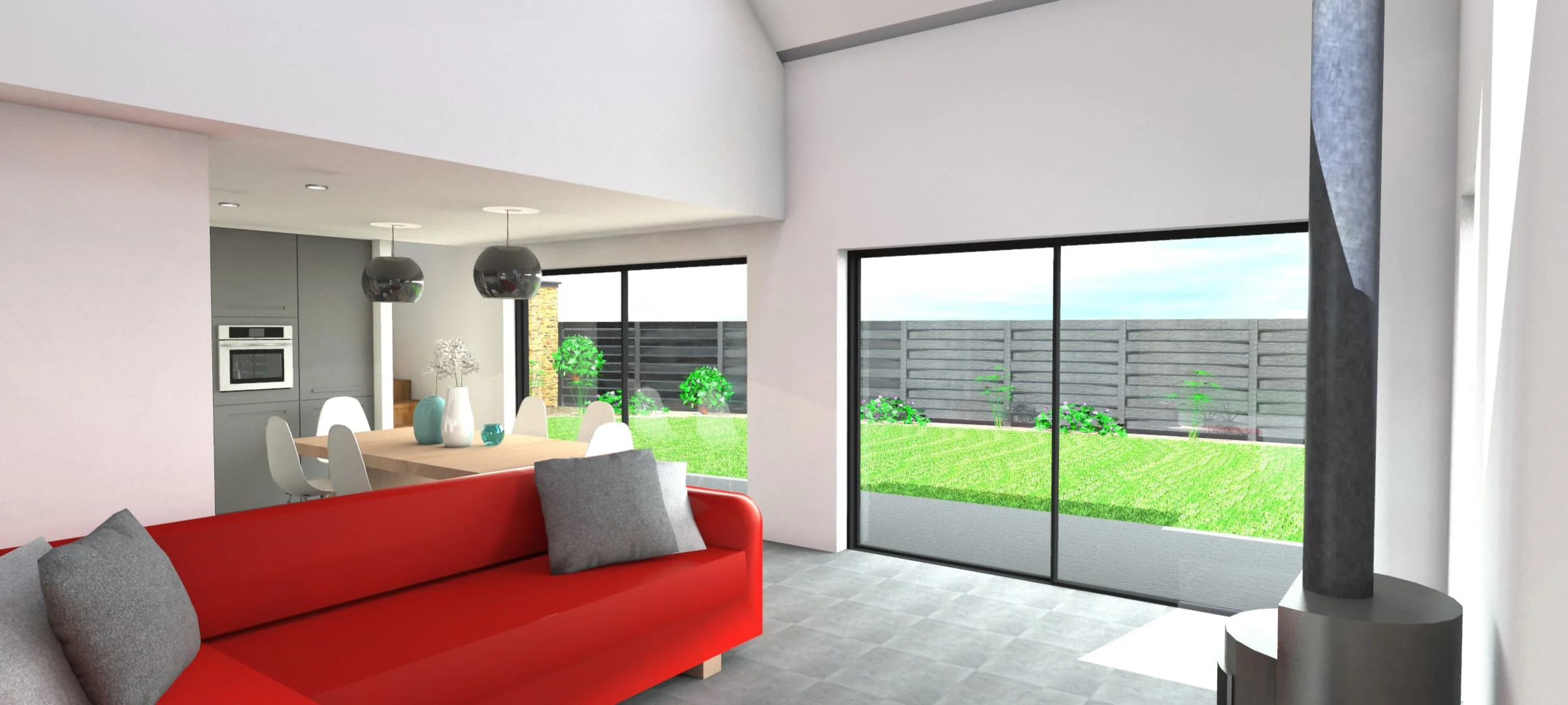
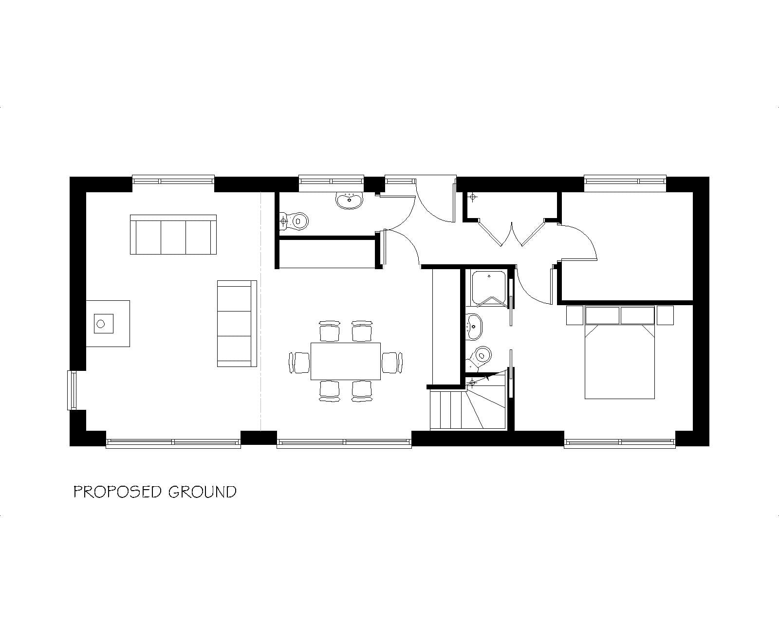
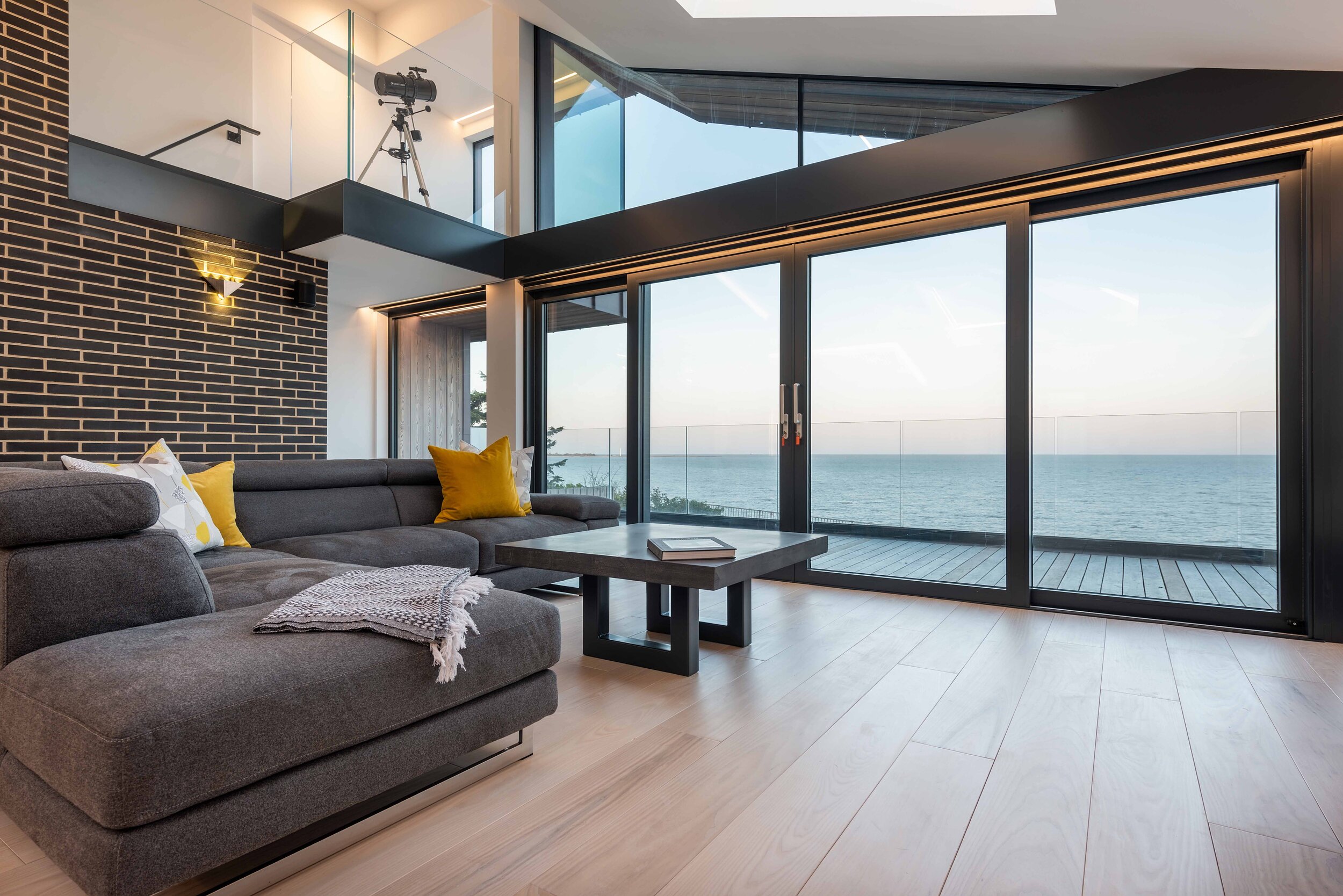
Harvey Norman’s response was to propose an upside-down house with two bedrooms and two bathrooms at the rear of a lower-ground cut into the hillside and double height double aspect open plan living space on the upper-ground.
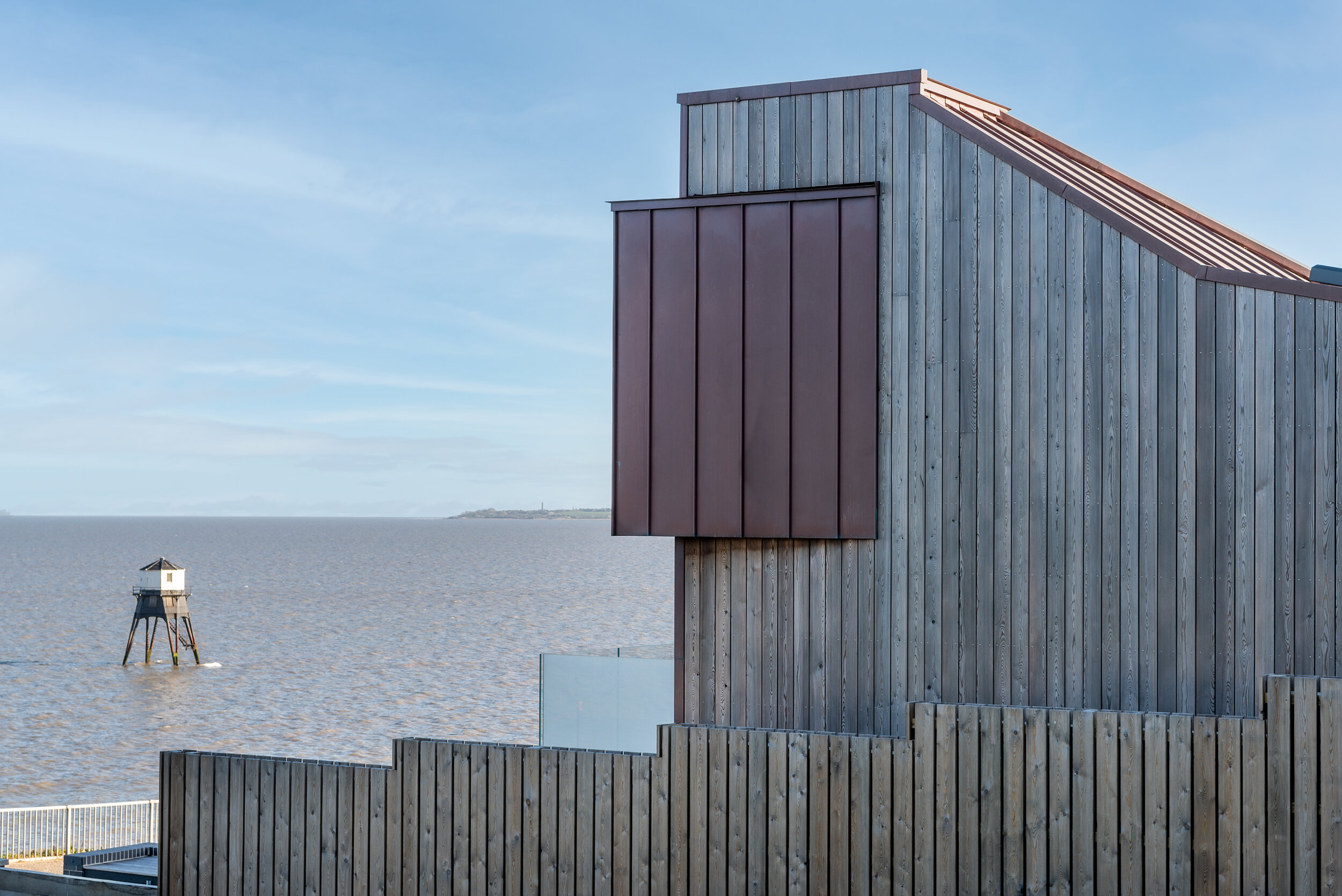
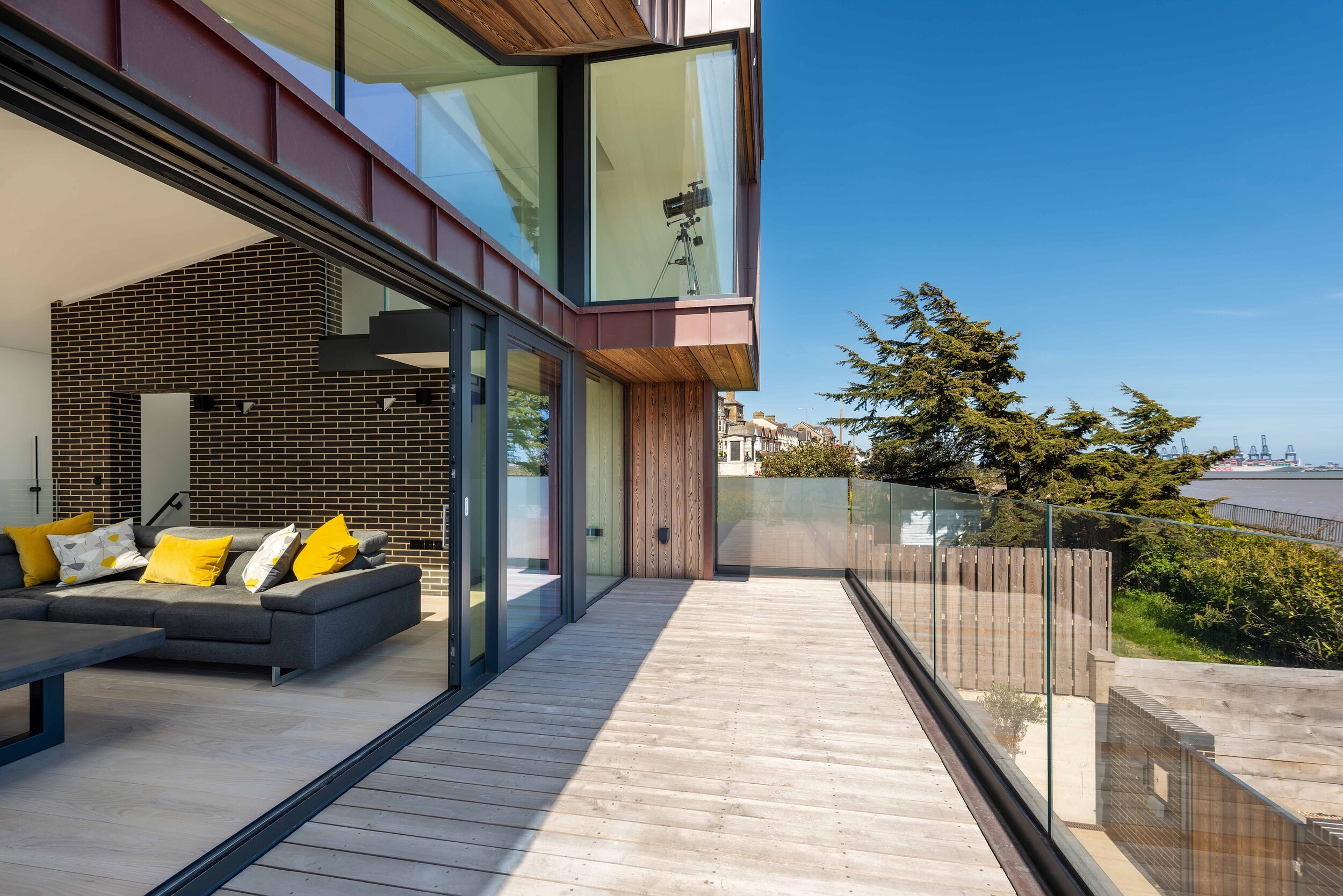
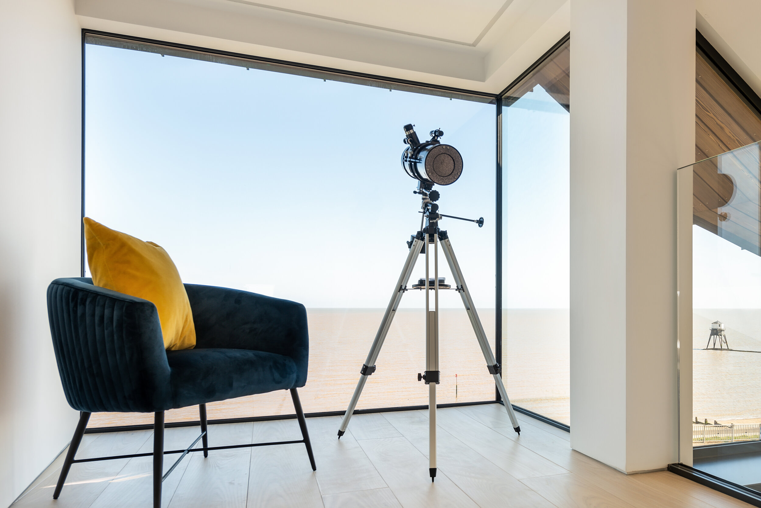
Picking up on the traditional notion of retired sea captains with their telescopes looking wistfully out to sea a crow’s nest viewing platform / projecting pod was proposed at second floor level forming a prominent architectonic feature in the building’s front elevation.
All three levels were to be linked by an architectural promenade starting from the external approach to the front door, then into and through a top lit two and a half storey high entrance space then around and up an open metal staircase with glass treads, up lit at night from below, terminating at the crow’s nest a level above and open to the upper-ground space below via a minstrel gallery. The promenade circulation zone is further emphasised by the supporting spine wall, clad in the same external elongated blue-black engineering brick used externally intended to give the impression of the external brick protruding into the interior from the outside.
In response to the sloped site and to simplify the superstructure build the substructure solution was to excavate into the slope and retain the entire site from boundary to boundary with a concrete box. This would mean the following advantages:
External access on all sides at the lower level.
Windows giving light and natural ventilation to the rear bathrooms
No superstructure tanking or damp issues to the superstructure.
Cutting the building into the slope also ensured that neighbours to the rear had their sea view protected as they would view the building from the rear as a single storey. The sloping copper cladding, triangular rooflights also gave them an interesting aspect.
The superstructure was created around a steel frame infilled at the lower-ground with masonry cavity wall construction and above at upper-ground level and the roof infill timber framing.
Because of the exposed nature of the site the building and external materials used needed to be tough, robust, watertight, and resistant to salt corrosion giving the building a distinct character. The choices were:
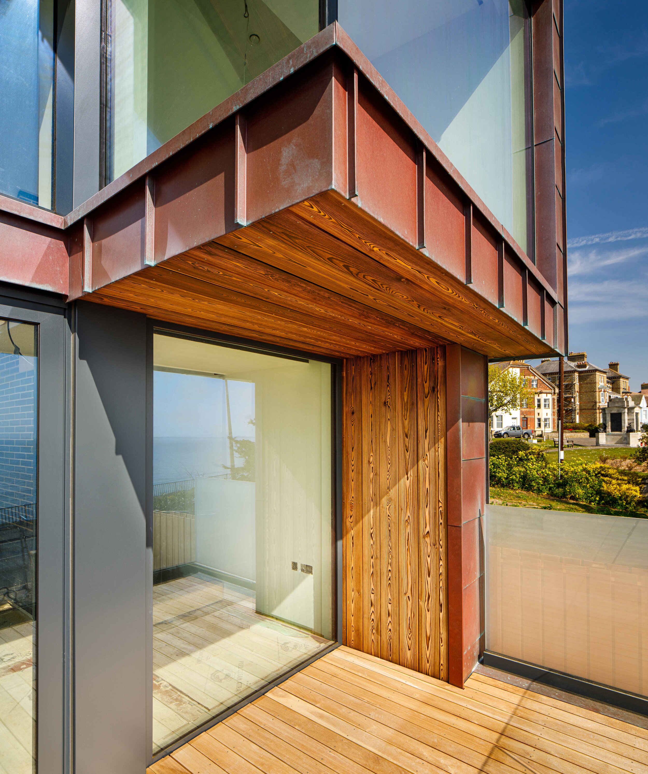
For the roof, a copper standing seam covering which in time will turn green. The project has since been awarded the classification “outstanding” by the Copper Development Association.
290 mm x 55 mm elongated and narrow facing blue black engineering brick for the lower-ground podium and front area boundary.
The upper levels are clad in, from a renewable, sustainable source, heavy brushed burnt/charred Siberian larch timber “Yakisugi (焼杉)” / “Shou Sugi Ban” cladding and copper cladding and facias.
Marine-grade powder coated aluminium external doors and windows.
Amenity space was maximised by the creation of three generous external spaces. Firstly, on the south-east elevation overlooking the sea, a protected lower-ground terrace outside the bedrooms bounded again, achieved by the engineering brick and glass-topped walls and directly above an upper-ground terraced balcony. The design also allowed two car parking spaces with three phase reaching supply, bin store and planters all discreetly integrated into the overall design, also creating defensible space separating the lower ground terrace and house generally from the public realm. Then, to the rear, an upper-ground more protected terrace from the elements, which also allowed disabled access to the upper-ground via a gate in the rear boundary.
On both the rear and front upper-ground terraces, the decking was constructed from teak boarding as found on boat decks. This material was also used on the front bin stores. The structure of the rear terrace platform was constructed from beam and block spanning between the building and the rear retaining structure which resulted in a covered undercroft storage area and workshop below.
SUSTAINABILITY
From the outset of the design, not least because of the wish to maximise glass openings and views to the south-east which could run the risk of overheating, the evolving design was modelled using the Passive House Planning Package (PHPP) software, providing confidence that the performance targets could be achieved. This model was then revived as the detailed and technical design evolved and resulted in the choices and incorporation of the following strategies:
Passive solar design: The maximisation of heat gains from south-east facing opening during winter and the use of brick spine wall as a thermal store
External overhang shading on the south-east elevations at both levels and internally using blinds.
Double glazing and glazing coatings.
The installation of an airtight layer and achieving good airtight construction. In the end the project had a target air change rate per hour of 3 per hour but achieved 2.24. However, to put this in context, the building regulations ask for 10.
A continuous enhanced thermal envelope of insulation. High attention to the avoidance of thermal bridging.
Utilising mechanical ventilation, heat recovery and high air quality.
Maximisation of natural daylight to the upper levels at all times of the day
Microgeneration was not viable, there was not enough space on the roof for enough photovoltaic panels, and there was a wish to protect the rear neighbour’s aspect. Ideally, an air source heat pump would have been the first choice, but due to a lack of external space a gas boiler and sealed heating system with a hot water storage tank with radiant heating. In addition to the ventilation heat recovery, when additional heating is required, it is distributed by underfloor heating throughout. The brick spine wall also contributes as a thermal store.
PROJECT HIGHLIGHTS
Because of Stephen’s background, the construction of the project was highly crafted with a high and precise level of workmanship and attention to detail.
The inclusion of the triangular rooflights and the double aspect on the upper-ground, as the sun moves, results in continuous high levels of natural light pouring into the building, changing the character of the interior depending on the time of day.
Due to the airtight construction and the use of high-quality double-glazed windows a high level of sound attenuation is achieved, giving the building a highly perceivable calm and restfulness.
Amazing views over the continually animated sea scape with the arrival of international shipping and ferries plus smaller craft and residents and holiday makers passing along the pedestrian promenade in front of the building.
Fantastic sunrises horizons over the sea
POSTCRIPT – Covid 19
Towards the middle of the build, Covid- 19 hit. This resulted in further challenges of fallow periods with no one working on-site, difficulties in obtaining and long lead-in and delays to materials. The project was however completed in Autumn 2020 the final irony being that due to lockdown restrictions on the use of second homes, Stephen has had to wait all winter to spend a night at the house. He is now in and is very happy.


